Guide to Balancing Image Weights

You can find this storyboard in the following articles and resources:

Layout and Composition Tips
By Sarah Laroche
Every great storyboard needs to start somewhere, and that somewhere is with a great layout. There are many things that go into making a storyboard excellent, but it always rests on its foundation: the layout.
'
Check out some of our other educational articles!
Storyboard Text
- Slide: 1
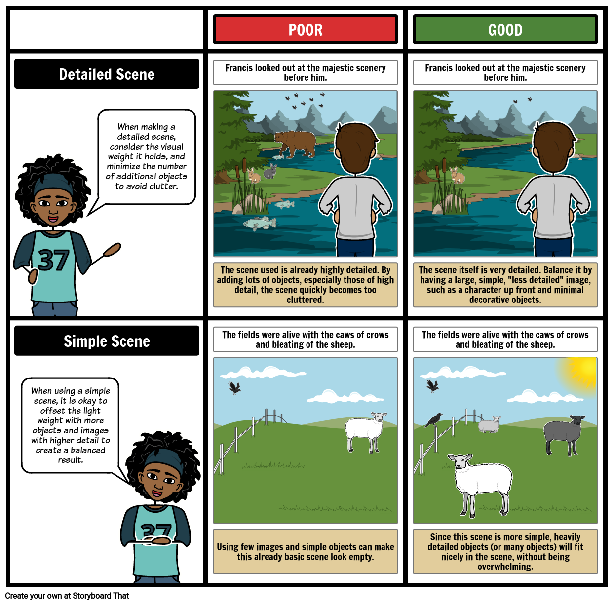
- Francis looked out at the majestic scenery before him.
- When making a detailed scene, consider the visual weight it holds, and minimize the number of additional objects to avoid clutter.
- The scene used is already highly detailed. By adding lots of objects, especially those of high detail, the scene quickly becomes too cluttered.
- Slide: 2
- Francis looked out at the majestic scenery before him.
- The scene itself is very detailed. Balance it by having a large, simple, less detailed image, such as a character up front and minimal decorative objects.
- Slide: 3
- The fields were alive with the caws of crows and bleating of the sheep.
- Using few images and simple objects can make this already basic scene look empty.
- Slide: 4
- The fields were alive with the caws of crows and bleating of the sheep.
- Since this scene is more simple, heavily detailed objects (or many objects) will fit nicely in the scene, without being overwhelming.
- Slide: 0
-
- When using a simple scene, it is okay to offset the light weight with more objects and images with higher detail to create a balanced result.
Over 30 Million Storyboards Created
No Downloads, No Credit Card, and No Login Needed to Try!


