You’ve made a storyboard for a project, assignment, or idea and yet something seems to be lacking. You’ve got a great story and covered all the topics you need, but you still have this feeling that it could be even better. Look no further! This article will teach you all the tips and tricks you need to make your storyboard the absolute best it can be!
There are many subtle things that go into storyboard creation that add monumental value and create a professional look:
- Layout Efficiency and Cleanliness
- Character and Prop Positioning
- Cropping and Layering
- Color and Effects
- Consistency
Layout Efficiency and Cleanliness
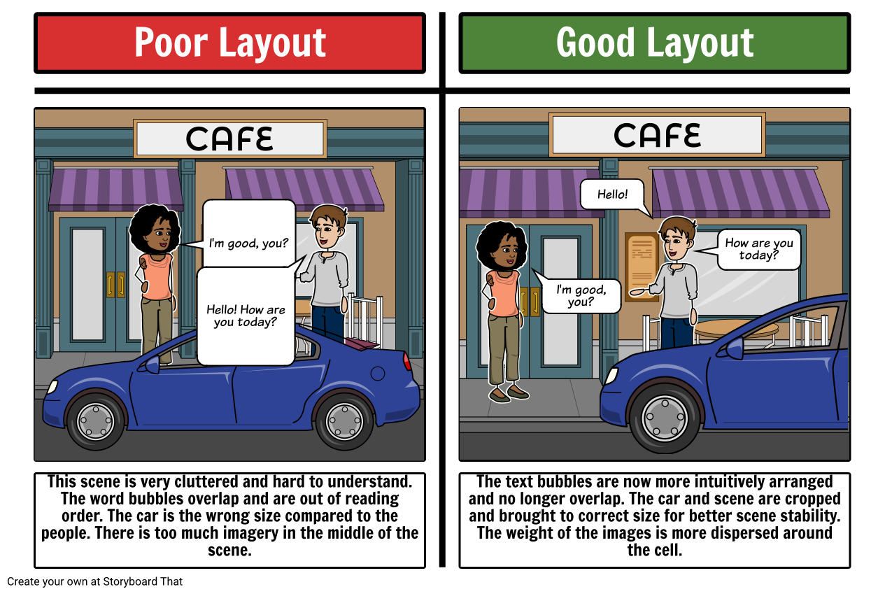
Any storyboard, no matter how good the content, can be ruined by a badly organized layout. The layout is the way scenes, characters, text and objects are arranged in the cell area. Using the space to its fullest and balancing all the components creates an aesthetically appealing final product.
Here is an example of bad layout and a better layout:
Character Positioning
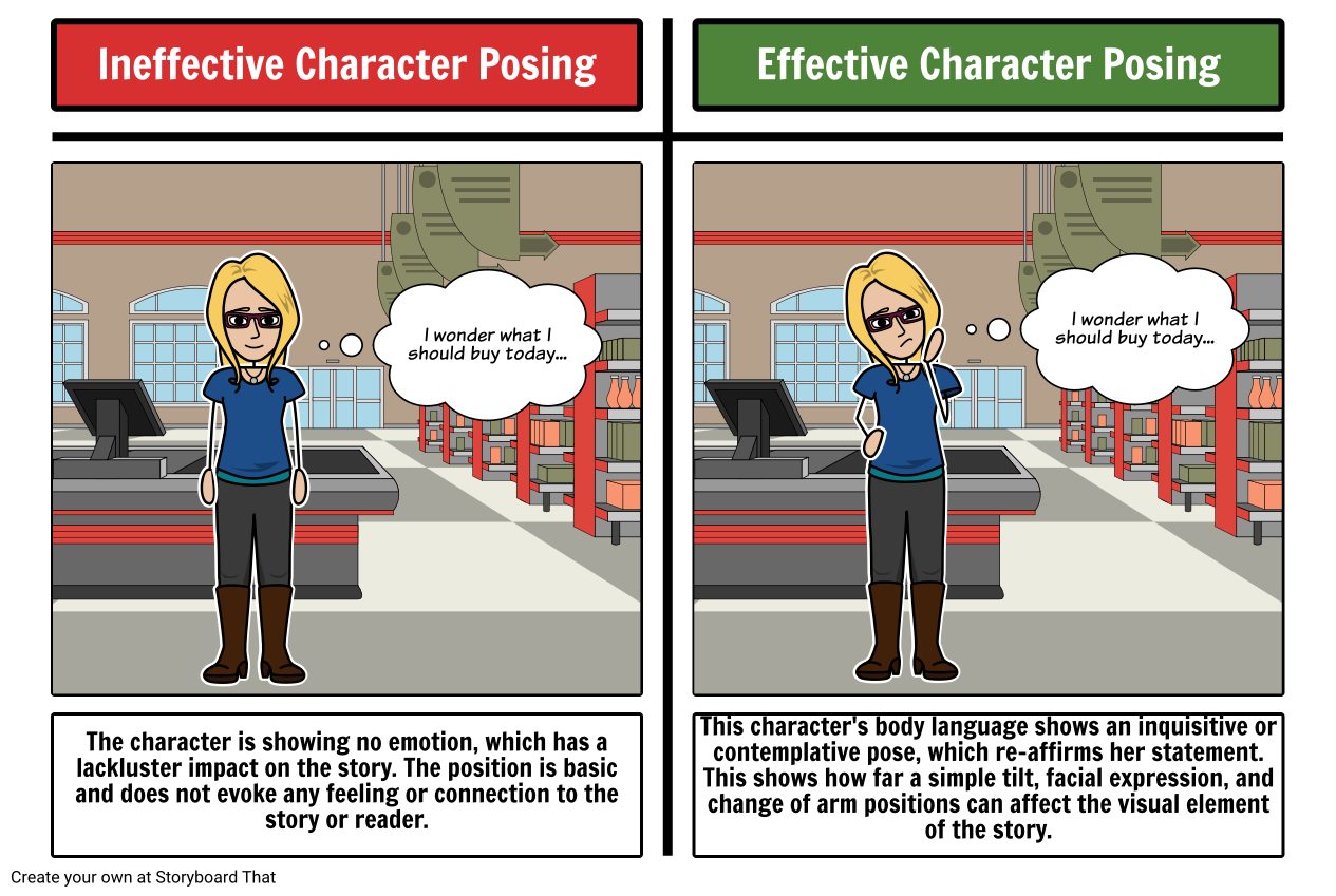
More often than not, storyboards are character driven, meaning the action is propelled by the characters. Your storyboards rely heavily on those key characters, and if they are missing emotion and intrigue, your story will be as well.
Be sure to take advantage of our character poser which allows you to change the expressions, arms, and legs of your characters. Body language is crucial when trying to express emotions or ideas with a character.
Here is an example of ineffective and good character posture in a scene:
Cropping, Sizing and Layering
By re-sizing, layering and taking advantage of the ability to crop characters, scenes, and items, a whole new dimension of storyboarding can be reached. By incorporating cropping, sizing and layering, you can create the illusion of forefront, middle-ground and background. This illusion keeps your storyboard from being flat and two dimensional.
Below is an example on how cropping, sizing and layering can bring depth to a storyboard:
This plot diagram for Wringer by Jerry Spinelli is another excellent example of how differentiating shots and angles, using close ups as well as far away and medium shots can add interest and movement to the story.
Notice how some characters are cropped and resized in the foreground while other characters and objects are smaller and layered in the background.
Coloring and Effects
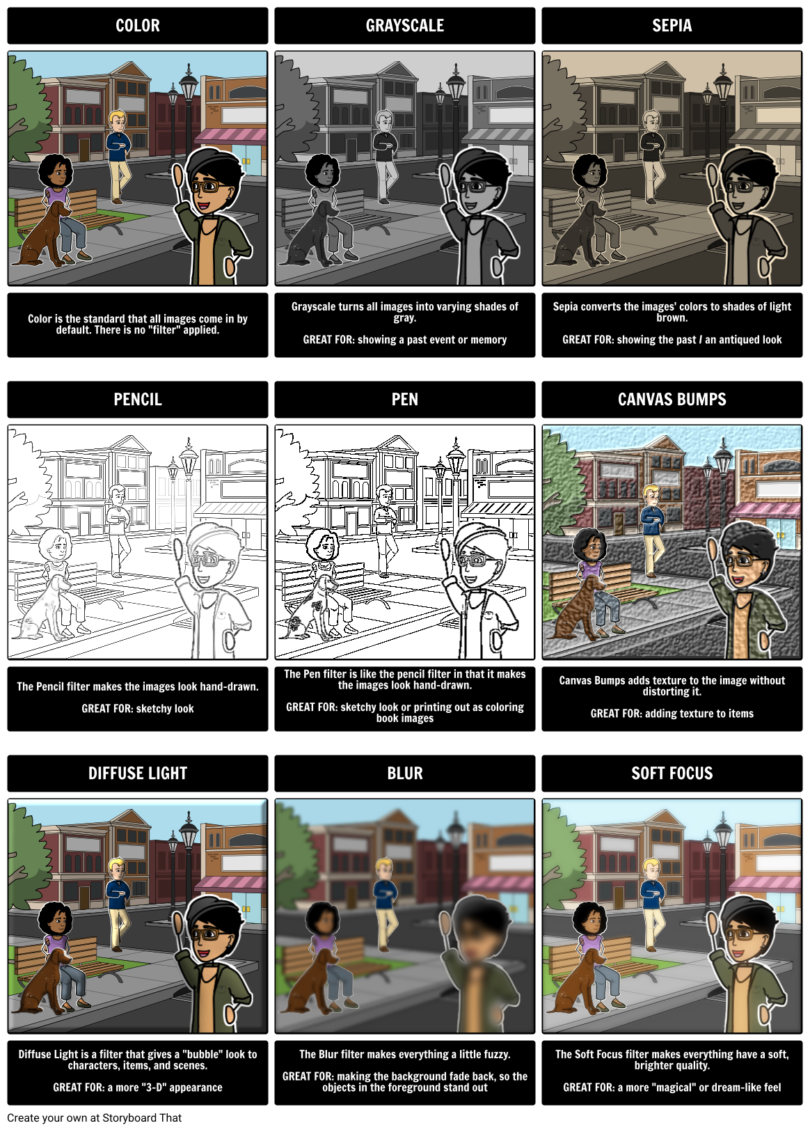
Storyboard That offers special effects that can be added to individual objects or an entire scene. Using sepia and black and white filters can give the illusion of the past, an imagined situation, or a memory. There are also textured effects available that add canvas bumps or diffuse light. There is also a pencil option to make your storyboard look more like a sketch!
Here is an example of each of the effects on the same image:
Consistency
Although consistency is not a magical tool on Storyboard That’s drag and drop creator, it is a key skill to master in order to make storyboards fluent and congruent.
Consistency in storyboarding means being sure to:
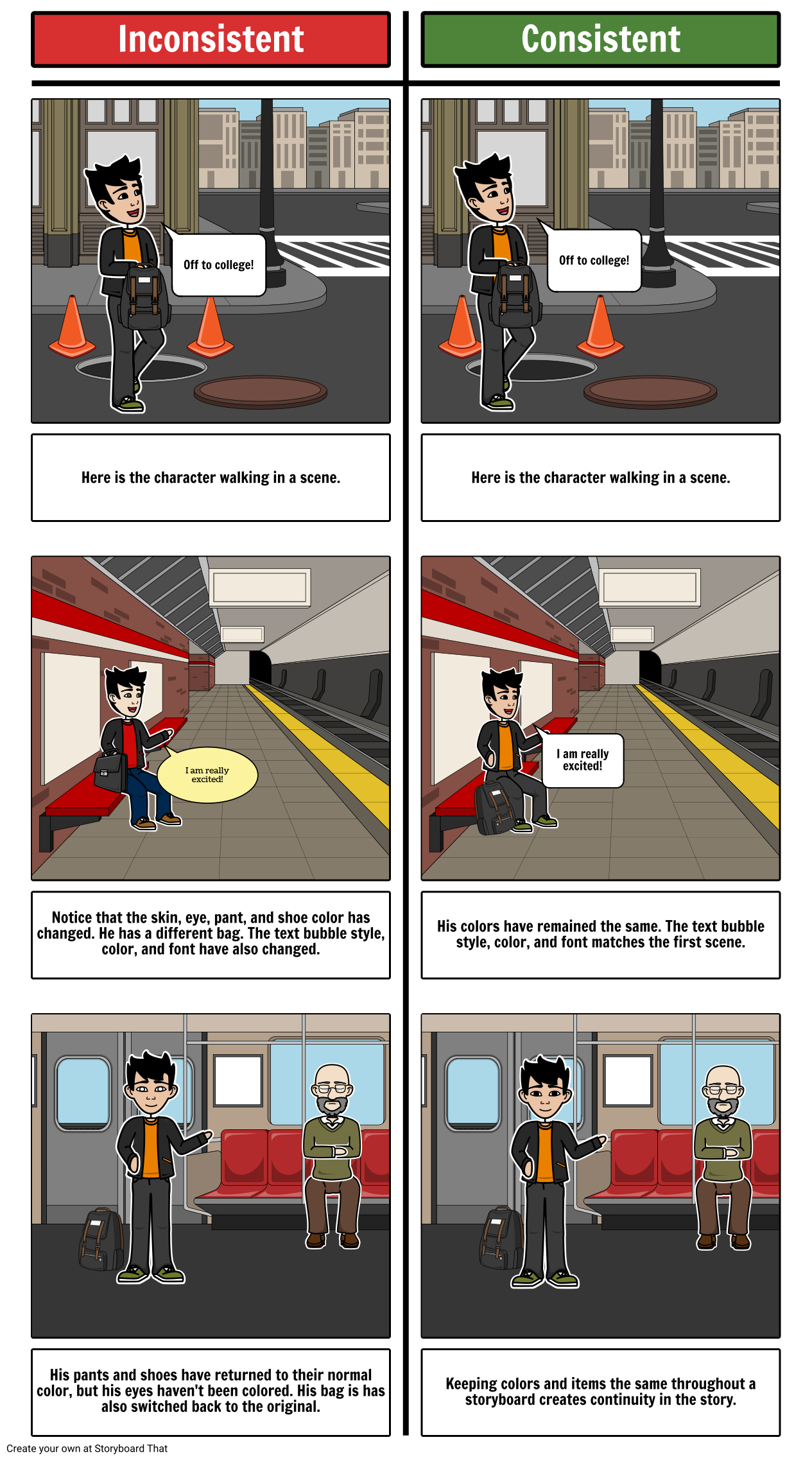
- Keep your characters colors the same through the storyboard
- Keep your texts’ font the same (Unless there is shouting or “noise effect” text)
- Stay with the same style of scenery (If you are writing about Ancient Egypt, you wouldn’t use a modern bedroom. This is where staying in a category can come in handy)
- Place your title or explanation text boxes in the same place in each frame/cell (and keep them lined up using the Align tool or the grid-lines)
- Use the same items in a storyboard if shown in multiple cells (i.e. don’t switch vacuums between one cell and another unless they are supposed to be two different vacuums)
Consistency is about creating a feeling of continuity from cell to cell, so that the viewer doesn’t get pulled out of the story by strange changes in character, scenery or objects.
Here is a contrast between bad and good consistency:
When creating your storyboards, it is important that you have fun and enjoy the experience. Using these tricks, tips, and ideas can make your boards “pop”, but it is your vision and input that really makes your final piece worth showing off!
How to Create Storyboards for Social Media Stories or Influencer Campaigns
Define the Objective and Target Audience
Clearly define the objective of your social media story or influencer campaign. Determine the specific message, call-to-action, or brand promotion you want to convey. Identify your target audience, considering their demographics, interests, and preferences.
Plan the Storyboard Structure
Determine the number of frames or slides you will need to tell your story effectively within the limitations of the social media platform. Outline the sequence of events, transitions, and key moments you want to capture in each frame or slide.
Sketch the Visual Elements
Begin sketching the visual elements for each frame or slide, including images, graphics, text, and captions. Focus on creating visually appealing and engaging content that aligns with the theme, tone, and branding of your social media story or influencer campaign.
Add Captions and Dialogue
Incorporate captions, dialogue, or text overlays that complement the visuals and provide context or storytelling elements. Ensure that the text is concise, impactful, and easy to read within the limited space of social media stories.
Consider Timing and Animation
Plan the timing and duration of each frame or slide to create a seamless flow and capture viewers' attention. If the platform allows, consider adding animations, transitions, or effects to enhance the storytelling experience.
Review and Refine
Review your storyboard to ensure that it aligns with your objective, target audience, and desired message. Seek feedback from peers or colleagues and make necessary refinements to improve the visual appeal, narrative coherence, and effectiveness of your social media story or influencer campaign.
Frequently Asked Questions About Effective Storyboarding
What is a storyboard?
A storyboard is a visual representation of a story or idea. It typically consists of a series of drawings or images that depict the sequence of events in a narrative or the flow of information in a presentation or other type of project.
Why is storyboarding important?
Storyboarding is important because it helps you to plan and visualize your story or project before you start creating it. It allows you to experiment with different ideas and see how they fit together, and it can help you identify any potential problems or challenges early on in the process.
What should be included in a storyboard?
A storyboard should include all of the key elements of your story or project, such as the characters, setting, plot, dialogue, and any important visual or audio cues. It should also include notes or annotations that provide additional context or guidance for the reader.
How many frames should a storyboard have?
The number of frames in a storyboard can vary depending on the length and complexity of your story or project. However, a typical storyboard might have anywhere from 10 to 100 frames or more, depending on the level of detail needed.
What are some best practices for storyboarding?
Some best practices for storyboarding include keeping your drawings simple and clear, using visual cues to convey key information, staying organized and consistent with your layout and style, and getting feedback from others to ensure that your story or project is effectively communicated.
What are some common mistakes to avoid when storyboarding?
Some common mistakes to avoid when storyboarding include getting too caught up in details and losing sight of the big picture, neglecting to include important information or cues, using inconsistent or confusing layouts, and not getting feedback from others before finalizing your storyboard.
Introductory School Offer
ONLY$500
- 1 School
- 5 Teachers for One Year
- 1 Hour of Virtual PD
30 Day Money Back Guarantee • New Customers Only • Full Price After Introductory Offer • Access is for 1 Calendar Year
© 2025 - Clever Prototypes, LLC - All rights reserved.
StoryboardThat is a trademark of Clever Prototypes, LLC, and Registered in U.S. Patent and Trademark Office


